- خانه
- معرفی پروژه
- طراحی معماری
- ساختمان تجاری-مسکونی مرز
منو
منو


فرم / عملکرد
حدود یک قرن پیش لویی سالیوان از رهبران معماری مدرن، یکی از معروفترین شعارهای معماری مدرن را مطرح کرد.
فرم از عملکرد پیروی می کند.
این شعار از اصلی ترین ویژگی های معماری مدرن بود و پس از او نیز در بسیاری از پروژه های معماری مبنای طراحی و قضاوت قرار گرفت . ماهیت این شعار بدین گونه بود که فرم کلی ساختمان با توجه به عملکرد آن تعریف می شد و بدین ترتیب فرم های مشخصی برای ساختمان های مسکونی، تجاری، فرهنگی و… شکل می گرفت. این ویژگی تا سالیان زیادی سرلوحه طراحی پروژه های معماری بود . اما با گذشت زمان و نیازهای اجتماعی و فرهنگی جدید و همچنین پیشرفت تکنولوژی پروژه ها با عملکردهای مختلف ماهیت جدیدی به خود گرفتند. رم کولهاس در کتاب S.M.L.XL پروژه های معماری را از لحاظ مقیاس مورد ارزیابی قرار داد و فرم پروژه ها را متاثر از تاثیرات اجتماعی و مقیاس آن ها در نظر گرفت.
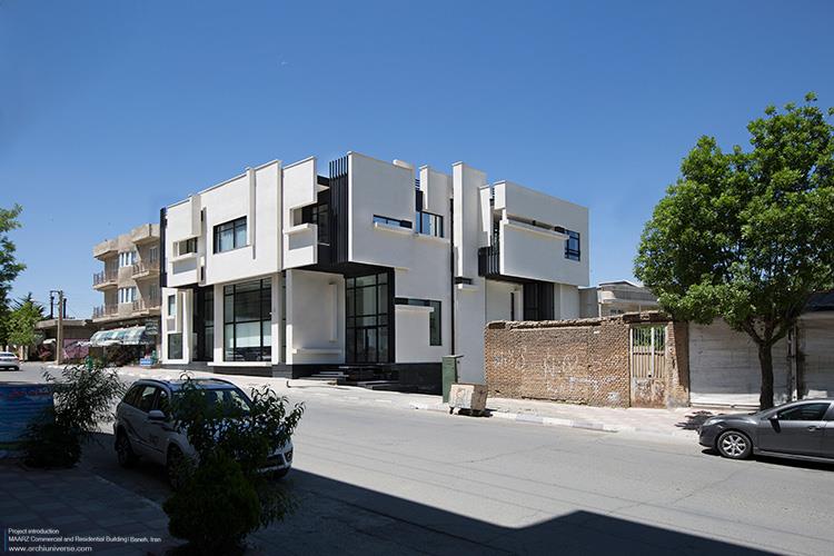
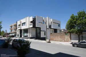
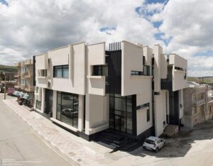
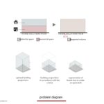
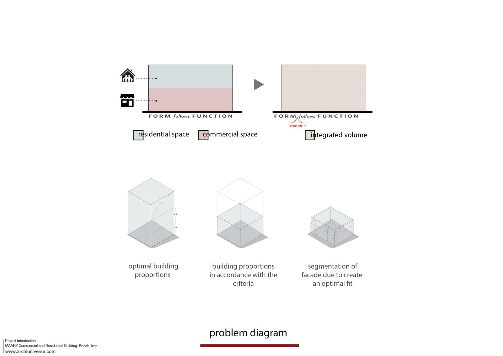
ساختمان تجاری و مسکونی مرز واکنشی است به شعار معماری مدرن (فرم از عملکرد پیروی می کند). با توجه به عملکرد تجاری و مسکونی (تک واحدی) و همینطور مقیاس و تناسبات پروژه، مهمترین چالش پروژه هماهنگی بین این دو عملکرد در حجم ساختمان در نظر گرفته شد و به چالش کشیدن این سوال که آیا واقعا فرم از عملکرد پیروی می کند مبتای طراحی قرار گرفت.
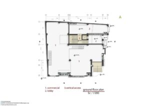
زمینه / سایت / برنامه
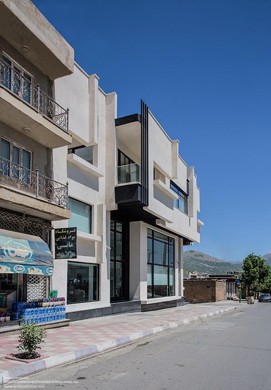
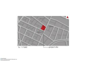
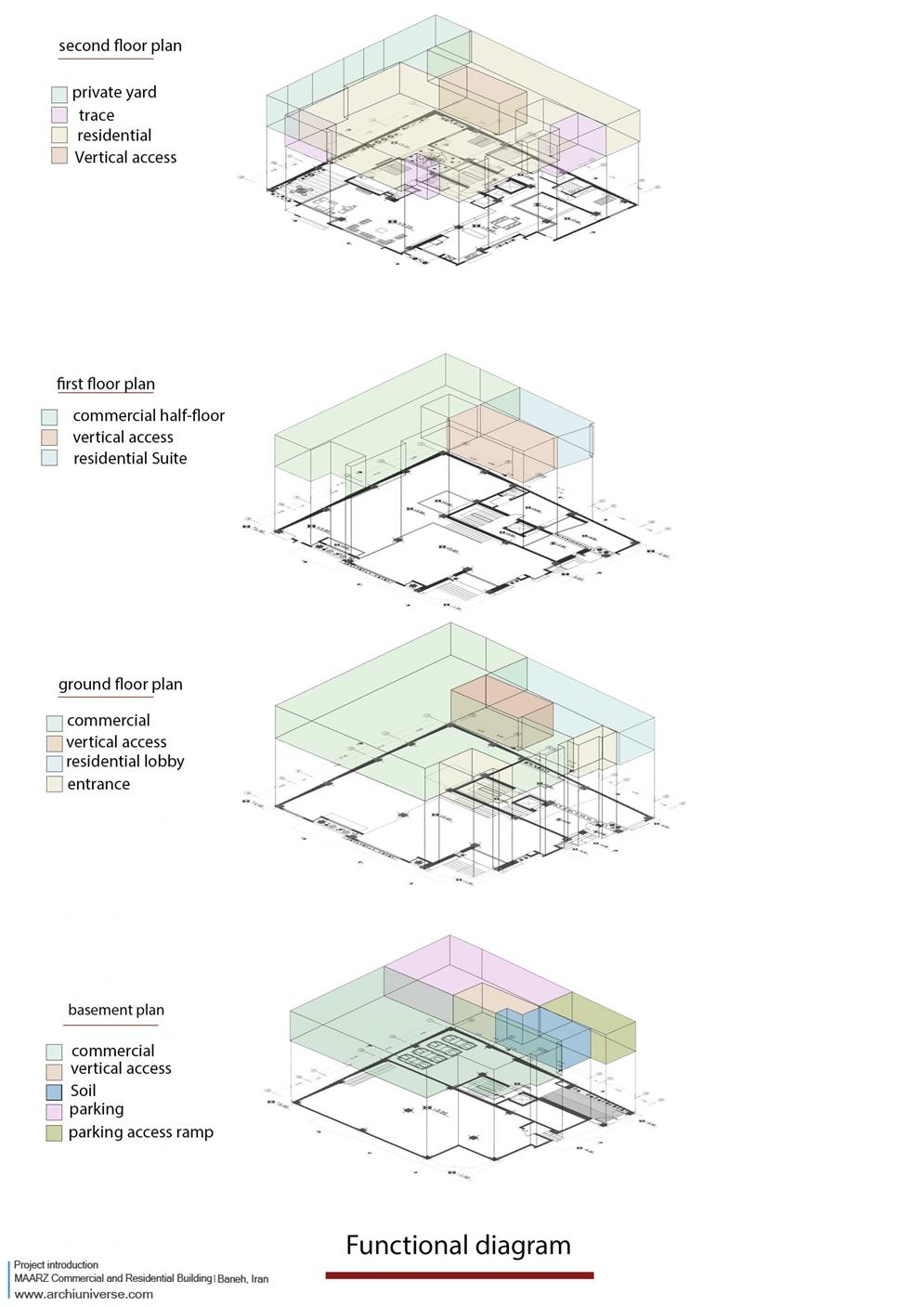
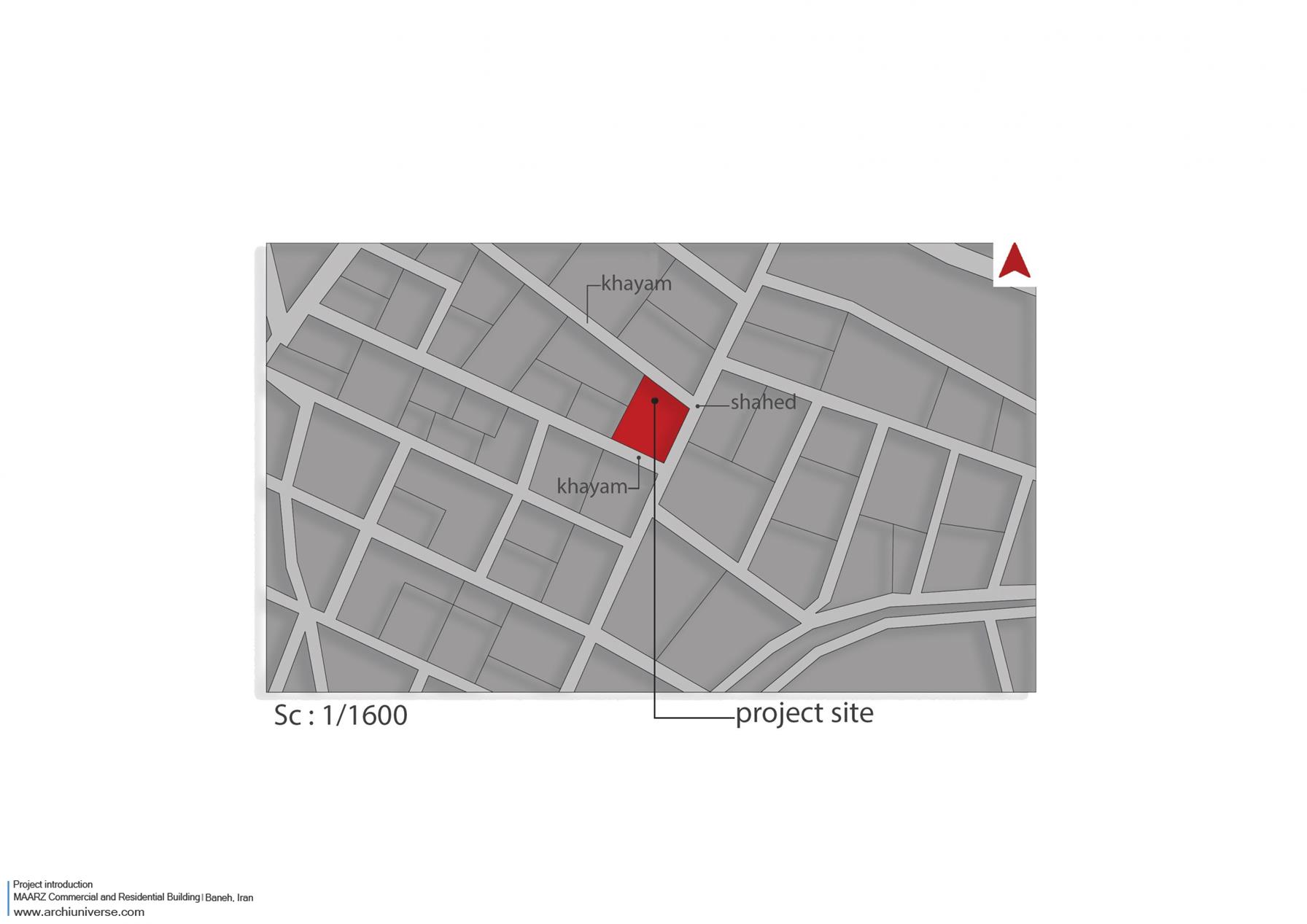
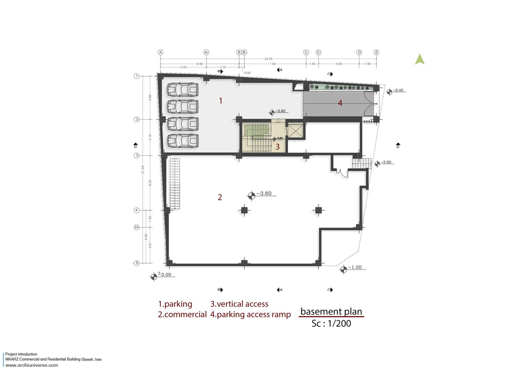
ساختمان تجاری و مسکونی مرز در شهر مرزی بانه در استان کردستان واقع شده است. شهر بانه در دامنه ی شمالی رشته کوه های زاگرس واقع شده و دارای اقلیمی کوهستانی می باشد. بافت شهر به صورت متراکم و فشرده بوده تا از اتلاف حرارتی جلوگیری شود. بیشترین مصالح مصرفی در ساختمان های شهر سنگ می باشد و اکثر ساختمان ها دارای طیف رنگی کرم، خاکی می باشند. سایت پروژه در یکی از بلوارهای اصلی شهر قرار گرفته و در نبش یک کوچه می باشد. زمین پروژه دارای مساحتی ۵۰۰ متر مربعی می باشد که از تجمیع 3 بلوک کنار هم شکل گرفته است. برنامه پروژه به گونه ای شکل گرفته بود که یک طبقه زیر زمین (پارکینگ و تجاری)، طبقه همکف و یک نیم طبقه (تجاری) و یک طبقه روی آن که یک واحد مسکونی به صورت تخت را شامل می شد. کارفرما خواستار ارتباط واحد تجاری زیرزمین با واحد تجاری طبقه همکف و همچنین ورودی کاملا مجزا برای واحد مسکونی بود. بدین ترتیب برنامه پروژه در یک واحد تحاری و یک واحد مسکونی خلاصه می شد. قرارگیری این دو عملکرد کنار هم که ازنظر ماهیت و نیاز ها کاملا با یکدیگر متفاوت هستند و هماهنگی آن ها در یک پروژه مهمترین چالش طراحی بود.
طرح
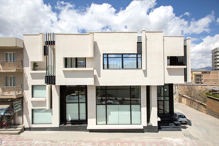
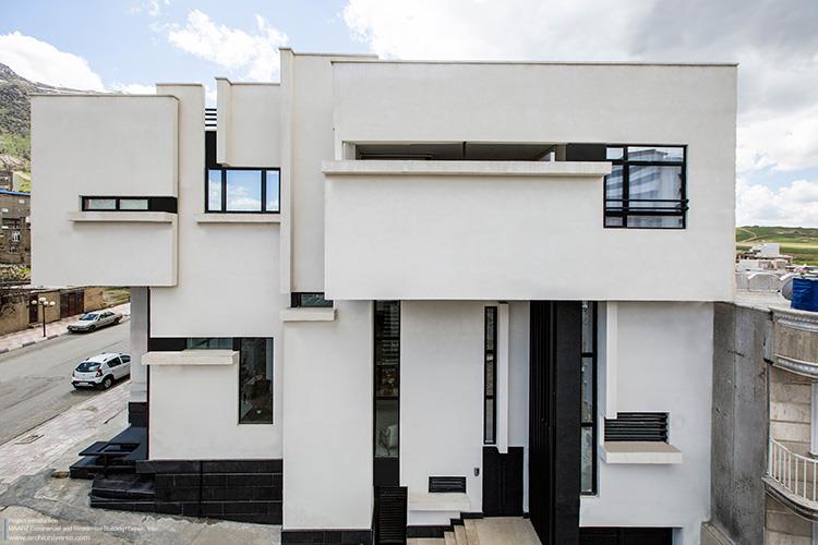
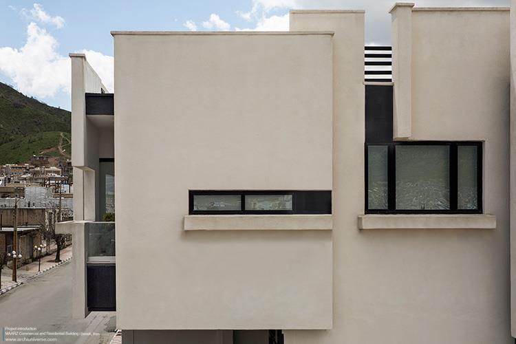
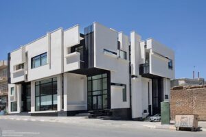
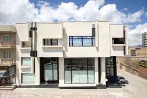
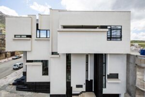
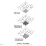
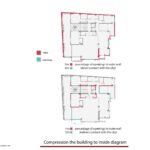
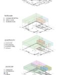
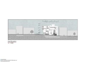
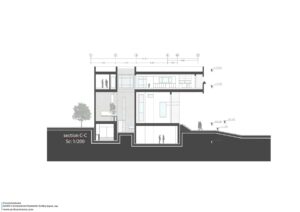
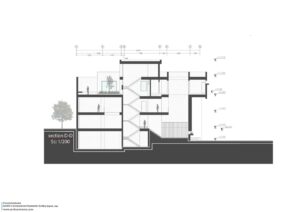
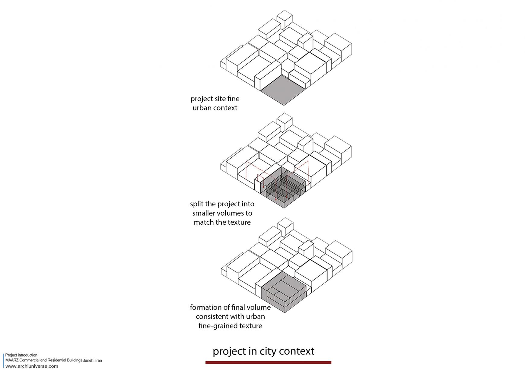
با توجه برنامه پروژه (یک واحد تجاری و یک واحد مسکونی) و مقیاس پروژه نسبت به بافت ریزدانه شهری، مهمترین مساله پروژه قرارگیری و هم پوشانی این دو عملکرد در کنار یکدیگر بود. سوال مطرح شده به گونه ای بود که پروژه باید بتواند خود را به صورت یک حجم یکپارچه در بافت شهری نمایان کرده و همچنین واکنشی باشد به شعار اصلی معماری مدرن (فرم از عملکرد پیروی میکند). بدین ترتیب به دلیل وجود دو عملکرد مختلف در پروژه و تاثیرات آنها بر جدار بیرونی و یکسان بودن ارزش بصری آنها در حجم (از لحاظ تناسبات طولی و ارتفاعی)، حجمی یکپارچه و هماهنگ که در کلیت به صورت یک فرم پیوسته دیده میشود، مورد بررسی قرار گرفت. برای پیشبرد این ایده و با توجه به تناسبات طولی، عرضی و ارتفاع ساختمان و هماهنگی حجم با بافت ریزدانه شهری از استراتژی خرد کردن حجم استفاده شد. با توجه به فضاهای درون پروژه و نیاز فضاها به نور، صفحاتی در نظر گرفته شد که با در کنار هم قرار گرفتن این صفحات، حجم اصلی شکل میگیرد.
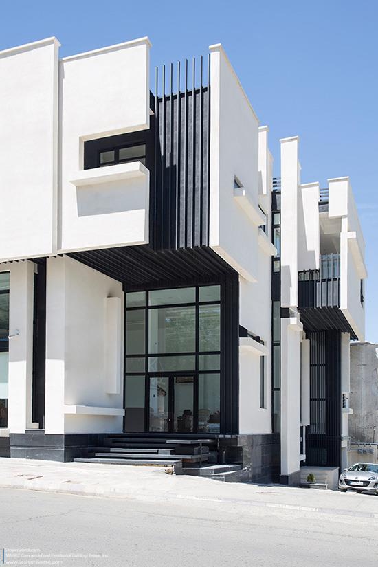
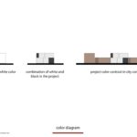
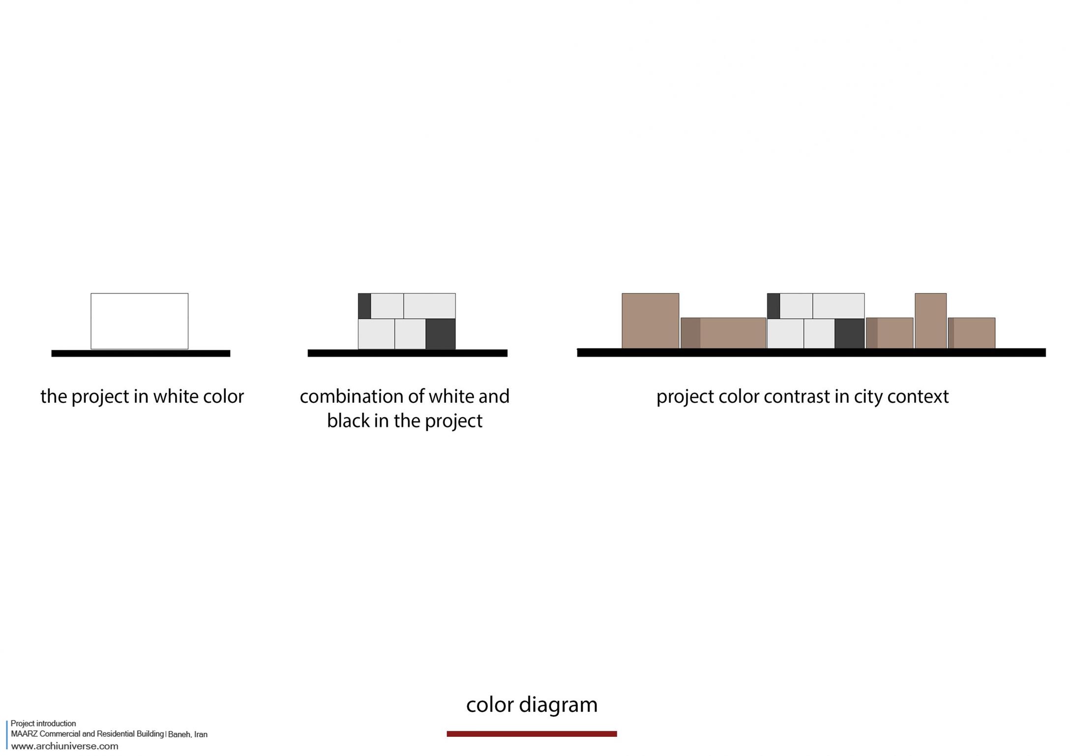
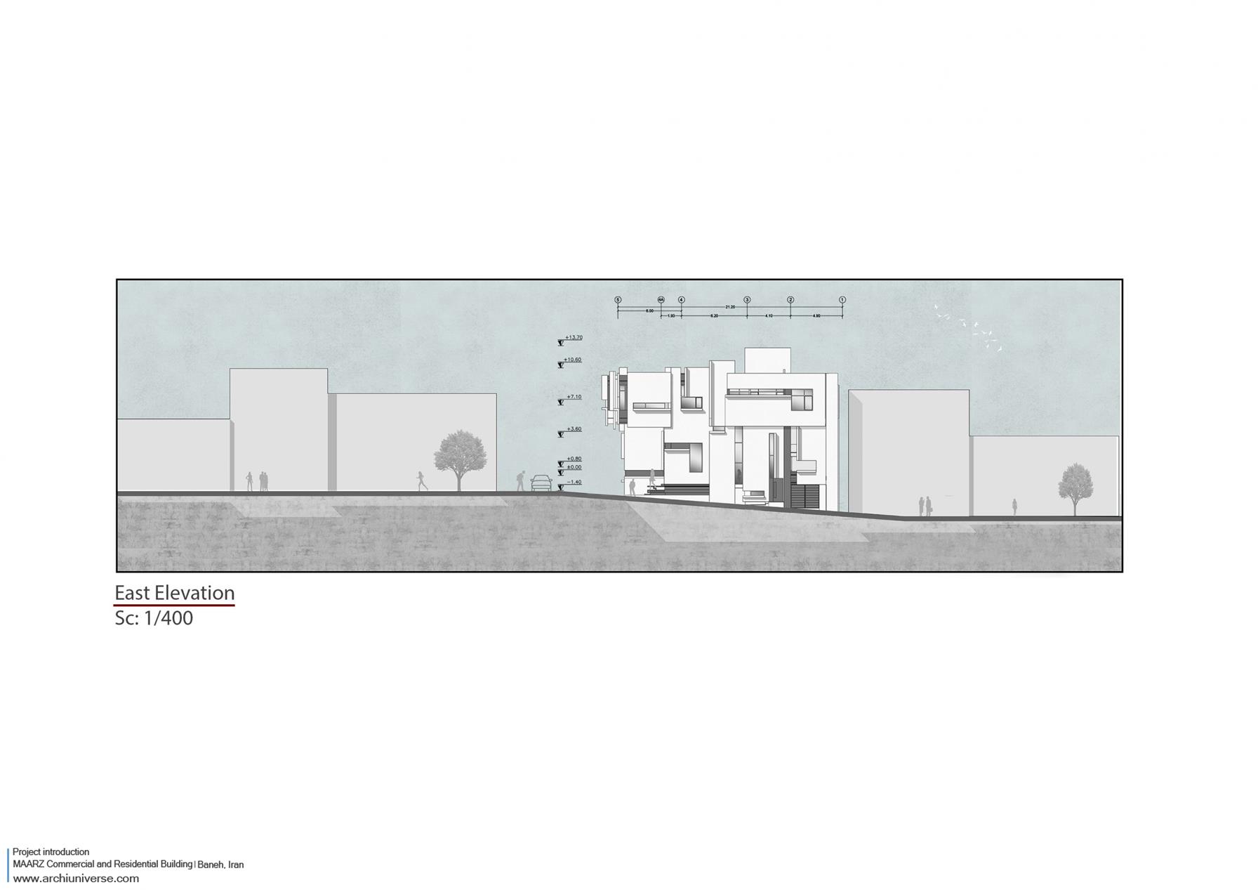
این صفحات و نوع تقسیم بندی و تناسبات آن ها بر اساس تناسبات طلایی شکل گرفت تا بتواند بیشترین بازدهی بصری را داشته باشد. برای فضای تجاری صفحات با مقیاس بزرگتر و بازشوهایی وسیعتر و برای فضاهای مسکونی نیز با توجه به عملکرد داخلی آن، بازشوهایی متناسب با فضاها شکل گرفت. بدین ترتیب پروژه به صفحاتی تبدیل شد که از کنار هم قرارگیری این صفحات به یک ججم واحد می رسیم که علاوه بر هماهنگی با بافت پیرامون خود، دارای چالشی در درون خود برای تبعیت فرم از عملکرد بود. با شکل گیری صفحات که پروژه را به چند حجم کوچکتر تقسیم کرده بودند، با عقب و جلو کردن صفحات نسبت به یکدیگر پروژه دارای عمق شد و نمای دوبعدی تبدیل به سه بعد شد. بازشوهایی که در هریک از صفحات قرار داشت با دیتیلی که نشان دهنده ی بریدگی صفحات بود شکل گرفتند. پس از شکل گیری حجم کلی، صفحات و بازشوها، برای نماین کردن پروژه در بافت شهری از عنصر رنگ استفاده شد. بدین گونه که تمامی صفحات شکل دهنده حجم از جنس سیمان سفید شکل گرفت و در فاصله بین صفحات از رنگ مشکی استفاده شد. در نهایت پروژه خود را به رنگ سیاه و سفید در بافت شهری نمایان کرد.
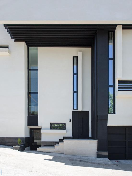
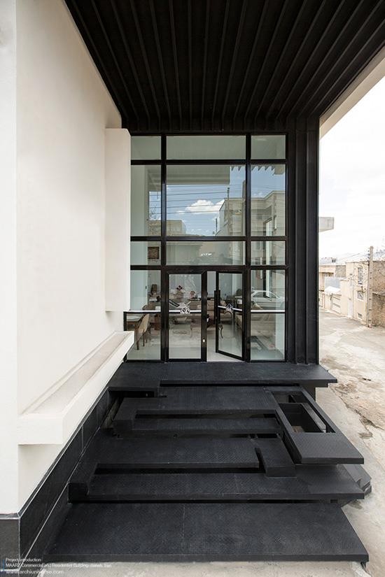
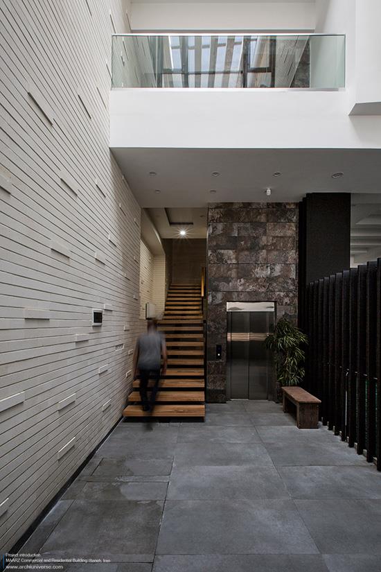
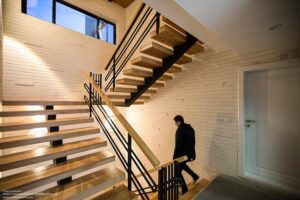
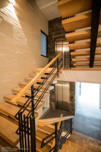
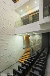
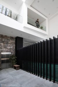
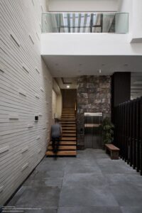
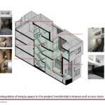
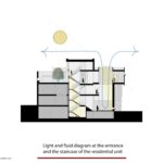
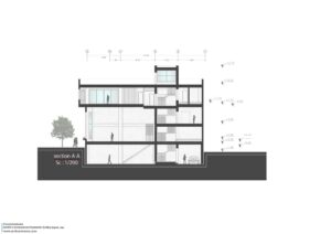
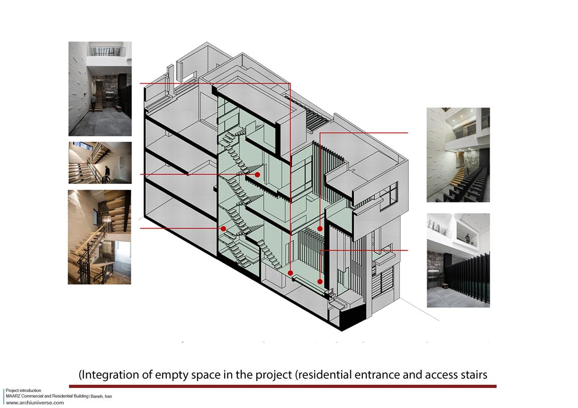
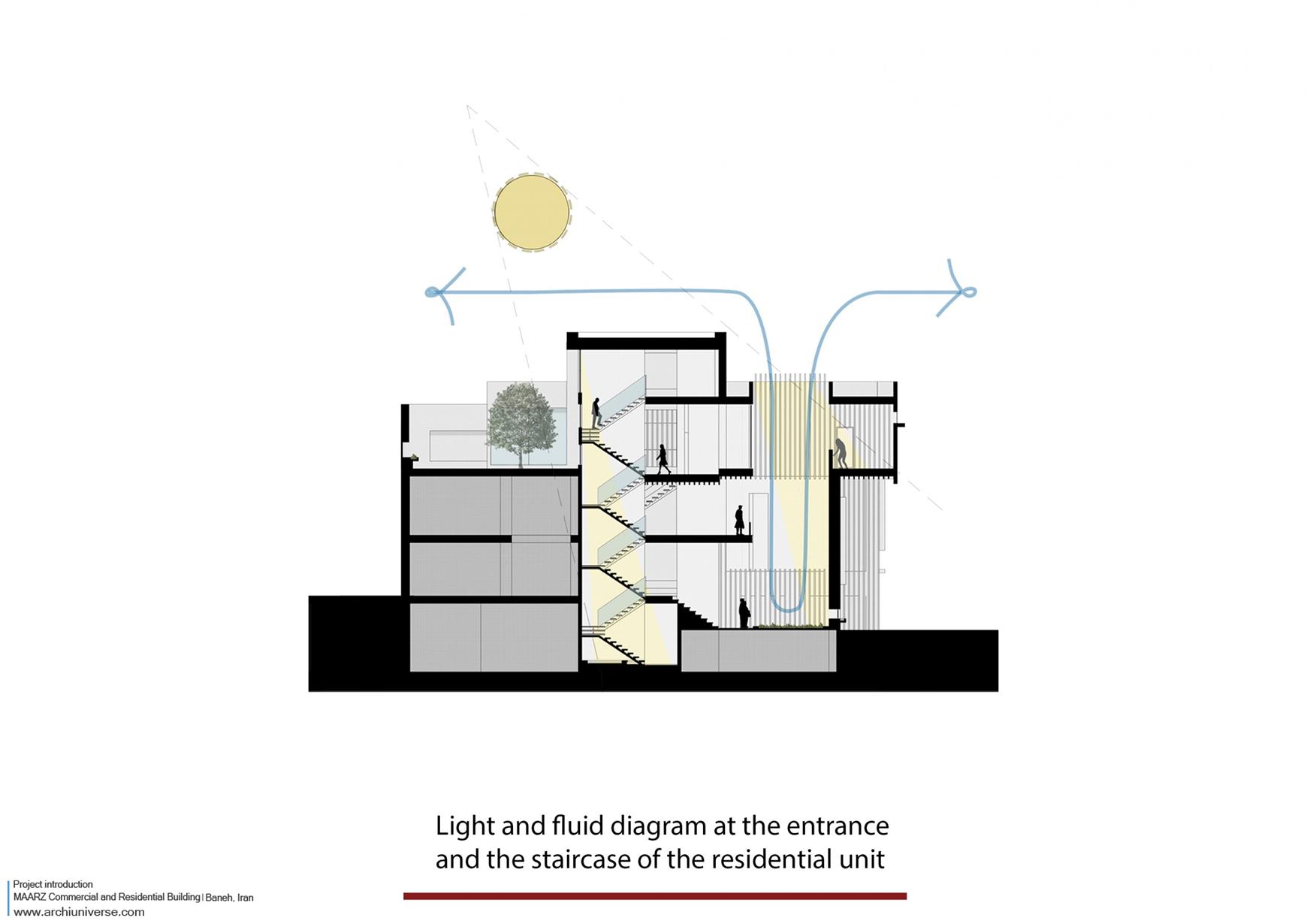
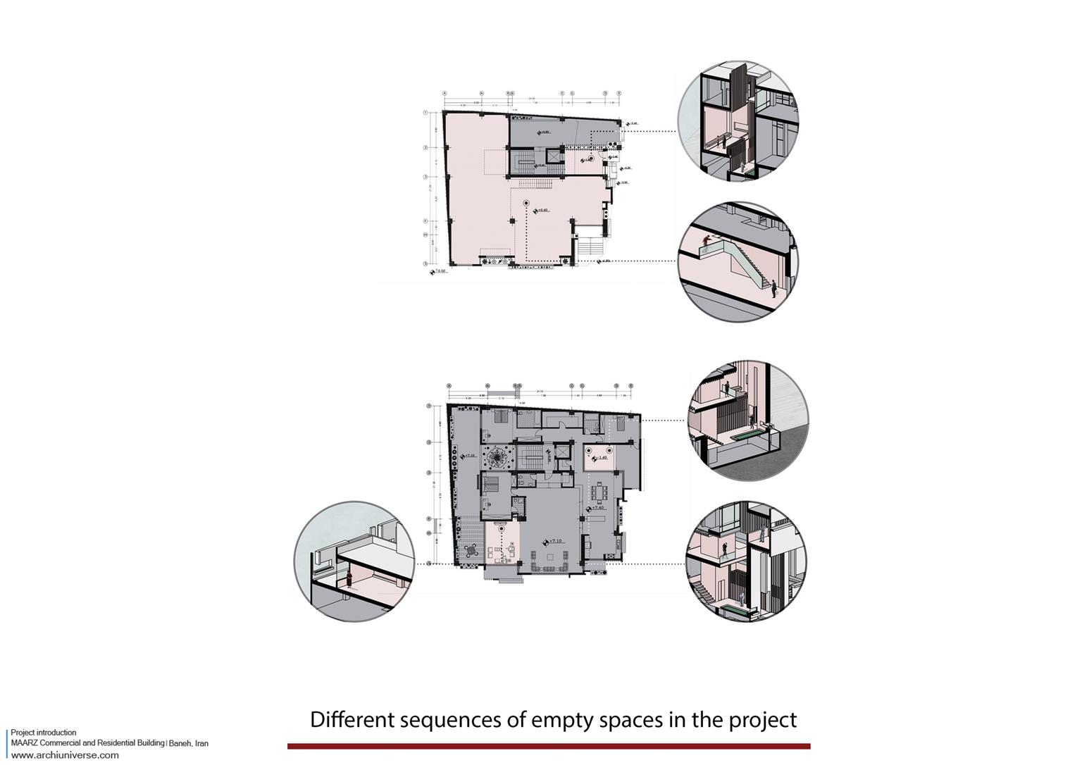
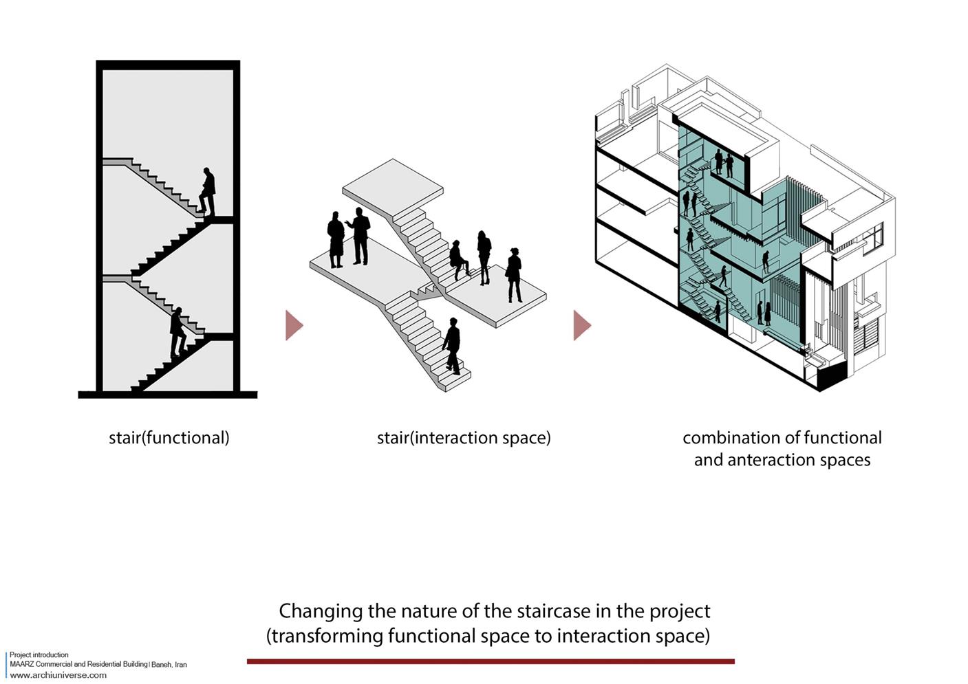
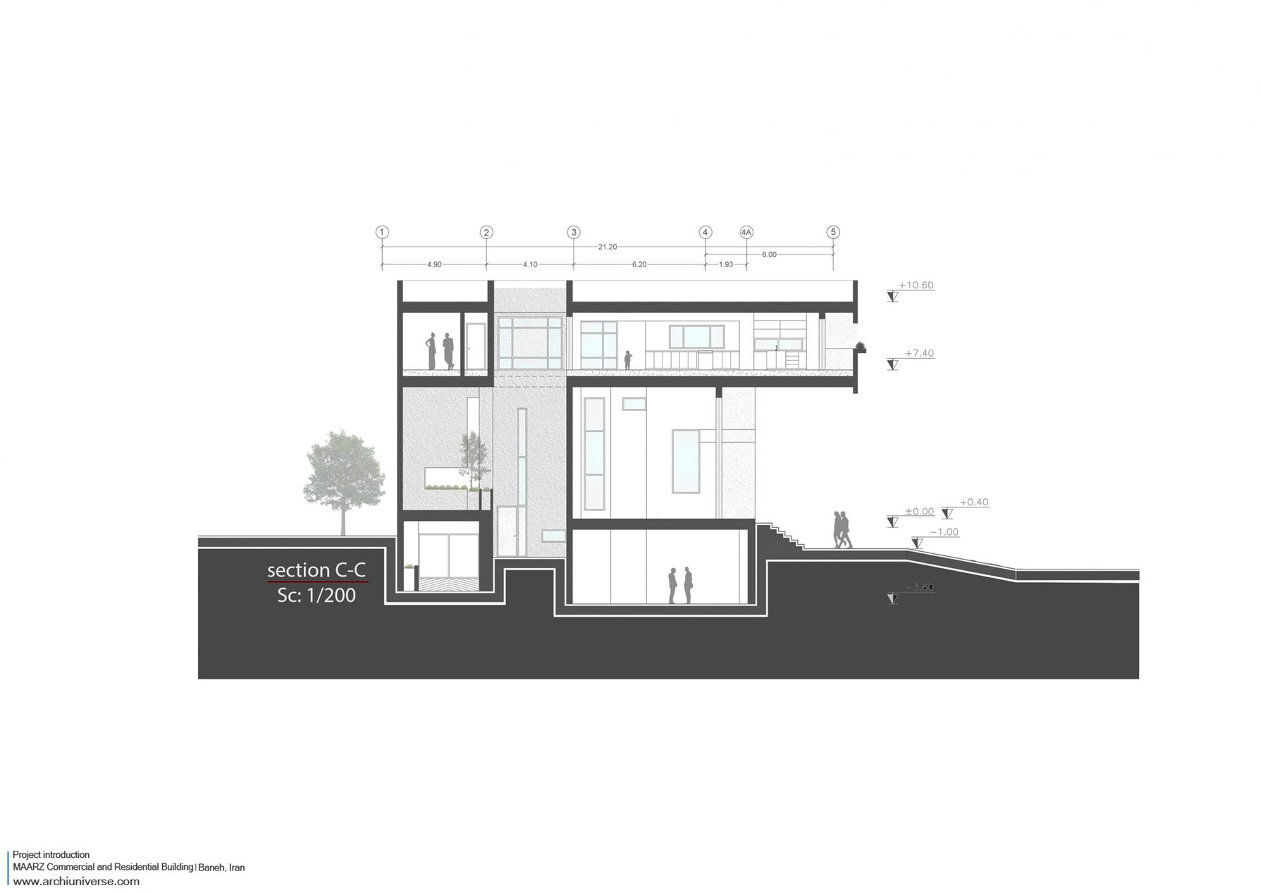
پله
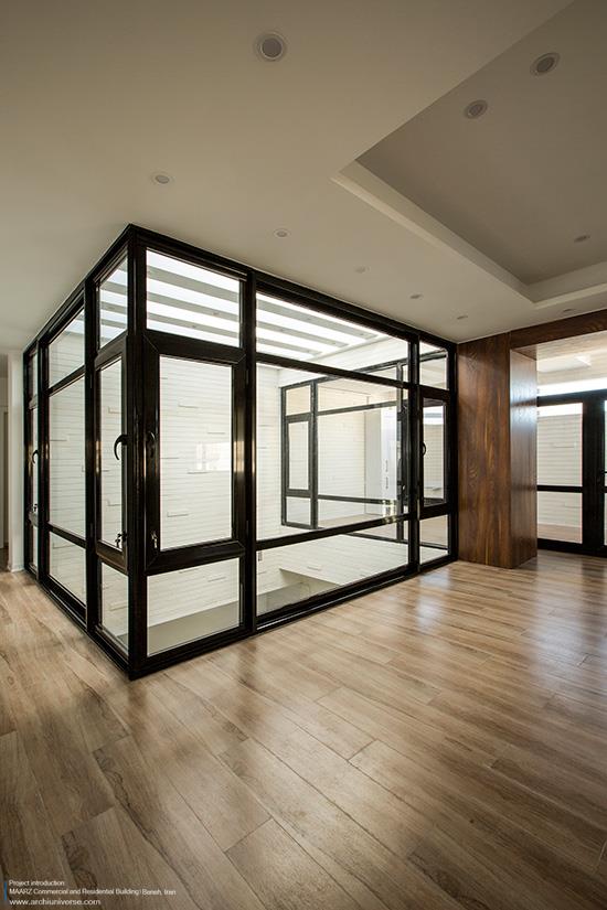
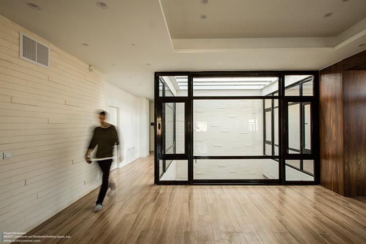
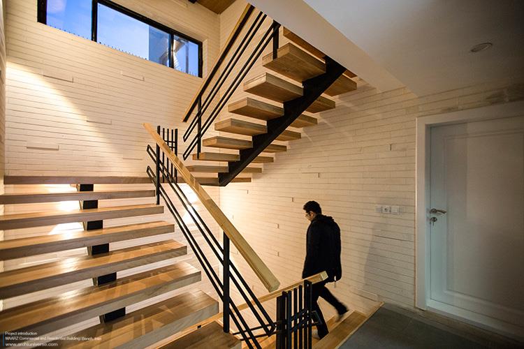
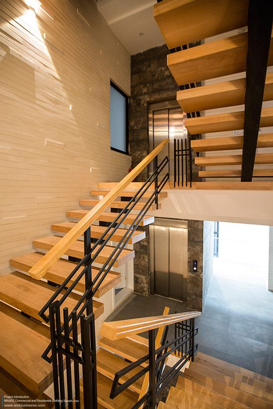
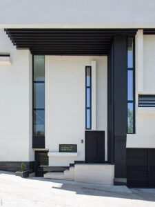
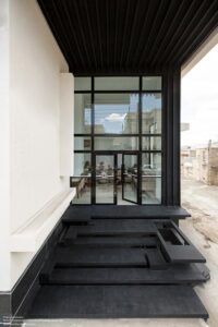
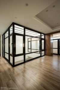
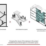
مسئلهی دیگری که در طراحی فضای مسکونی مورد توجه قرار گرفت ، ایجاد لایهای مابین فضای درون و بیرون بود که کیفیت فضایی هر دو را داشته باشد. این فضا در قسمت پلههای ورودی واحد مسکونی شکل گرفت و باعث شد پلههای دسترسی، که معمولا در ساختمانهای مسکونی به صورت فضای مرده قرار میگیرد ، به فضایی پویا و قابل استفاده تغییر ماهیت دهد. این لایهی مابین هم درون است هم بیرون ، هم این است و هم آن. این فضا علاوه بر حفظ برخی کیفیتهای فضای بیرونی (دید به آسمان و فضای تهی پیوسته ) ویژگی فضاهای داخلی نظیر محرمیت را هم دارد. تلاش شد با ایجاد این فضا، پله سازماندهی شود و در کنار آن ماهیتی تازه به خود بگیرد و کاربر بتواند در حیاطی خصوصی که با محیط بیرونی نیز در ارتباط است از کیفیت مناسب فضا لذت ببرد. همچنین با تغییر ماهیت پله، ما فضای عملکردی را به فضای تعامل تبدیل کردیم تا ضمن ایجاد راه ارتباطی بین فضاها و نور مناسب ، محیطی برای مکث و گفتگو ایجاد شود که از طبقات مختلف دید داشته باشد.
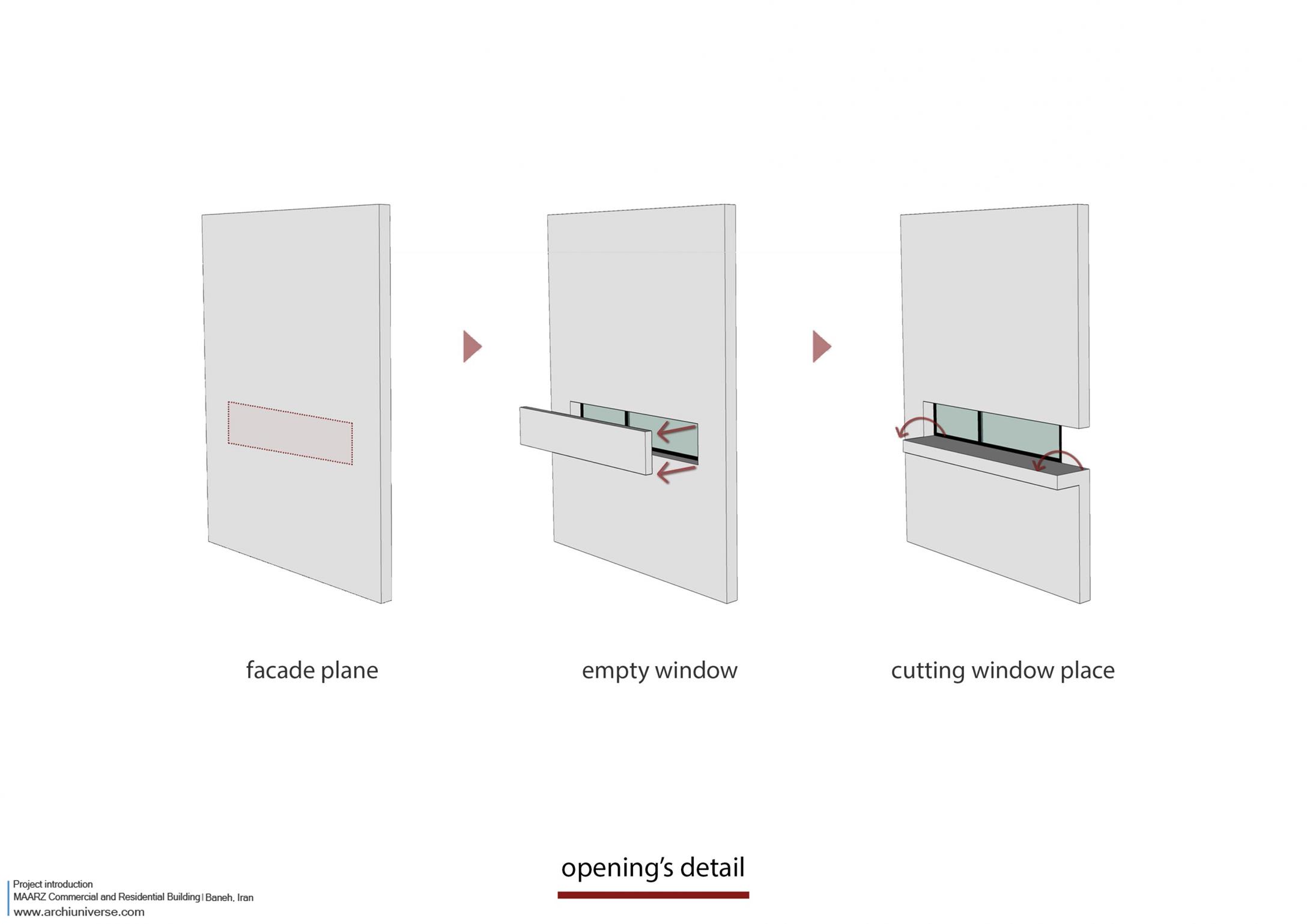
بازشو
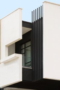
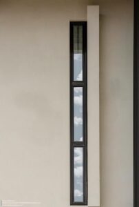
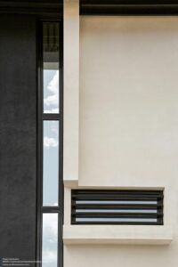
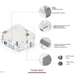
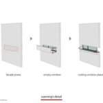
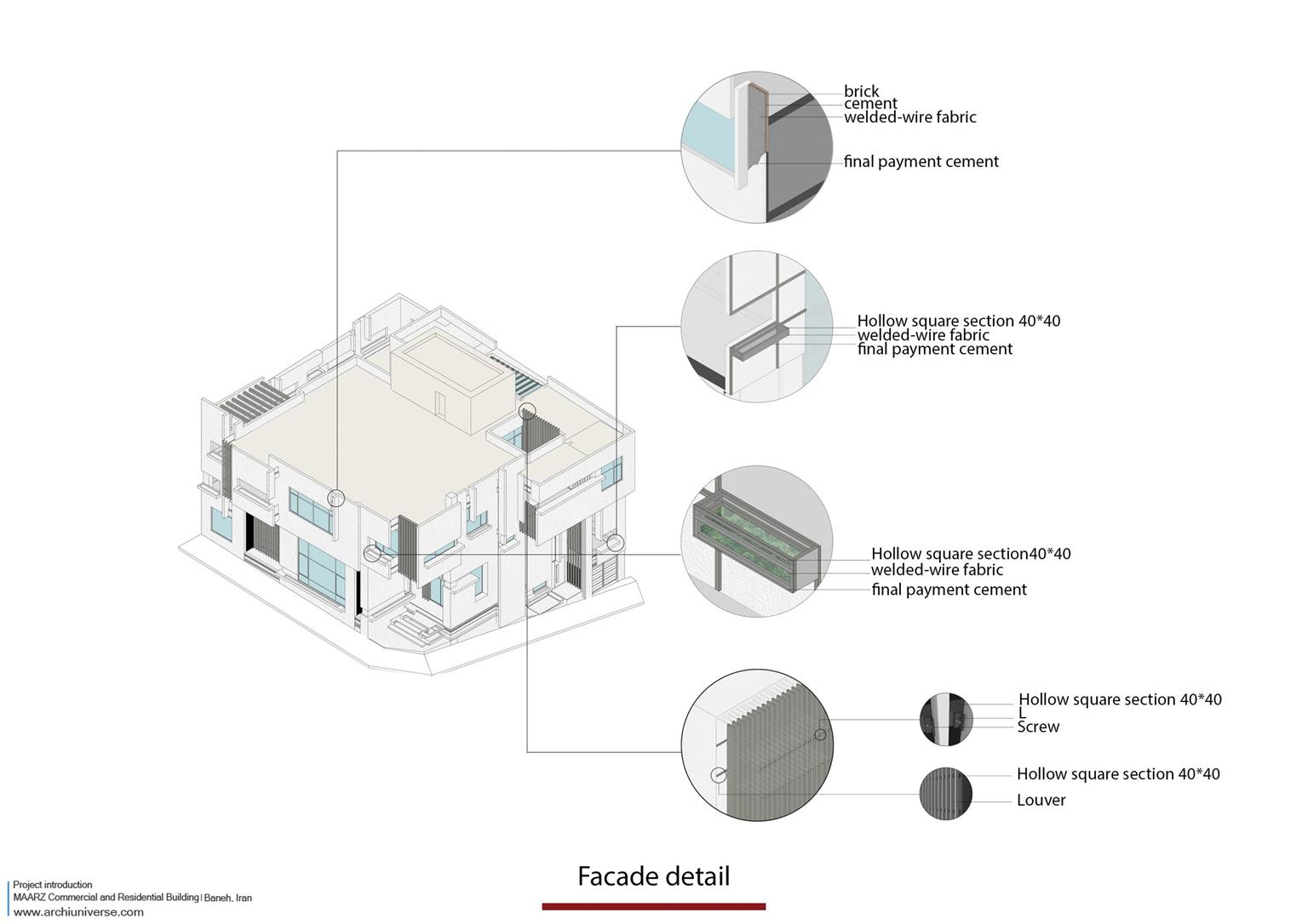
قرارگیری بازشوها با توجه به نیاز فضاهای داخلی به نور شکل گرفت. بدین گونه که هر فضا با توجه به تناسب و اندازه خود مقدار نور مورد نیاز را داشته باشد. پس از شکل گیری اندازه بازشوها دیتیلی خاص دیتیلی خاص برای هماهنگی بیشتر با پروژه طراحی شد. این دیتیل بدین گونه شکل گرفت که هر بازشو قسمتی از صفحه ای که بر روی آن قرار گرفته است را بریده و قسمت بریده شده را با چرخشی ۹۰ درجه ای تبدیل به سکویی برای قرارگیری گل و گیاه می کند. بدین ترتیب هر بازشو با بریدن صفحه علاوه بر تامین نیاز نوری و تهویه فضای داخلی، سبزینگی را نیز همراه دارد.
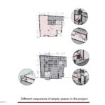
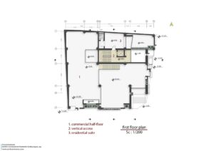
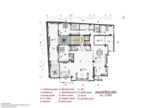
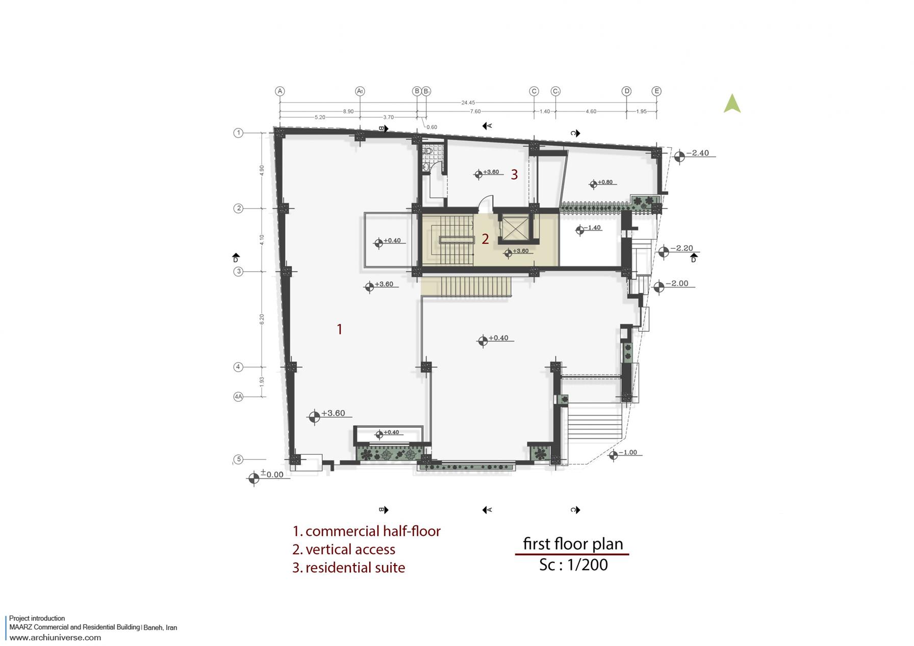
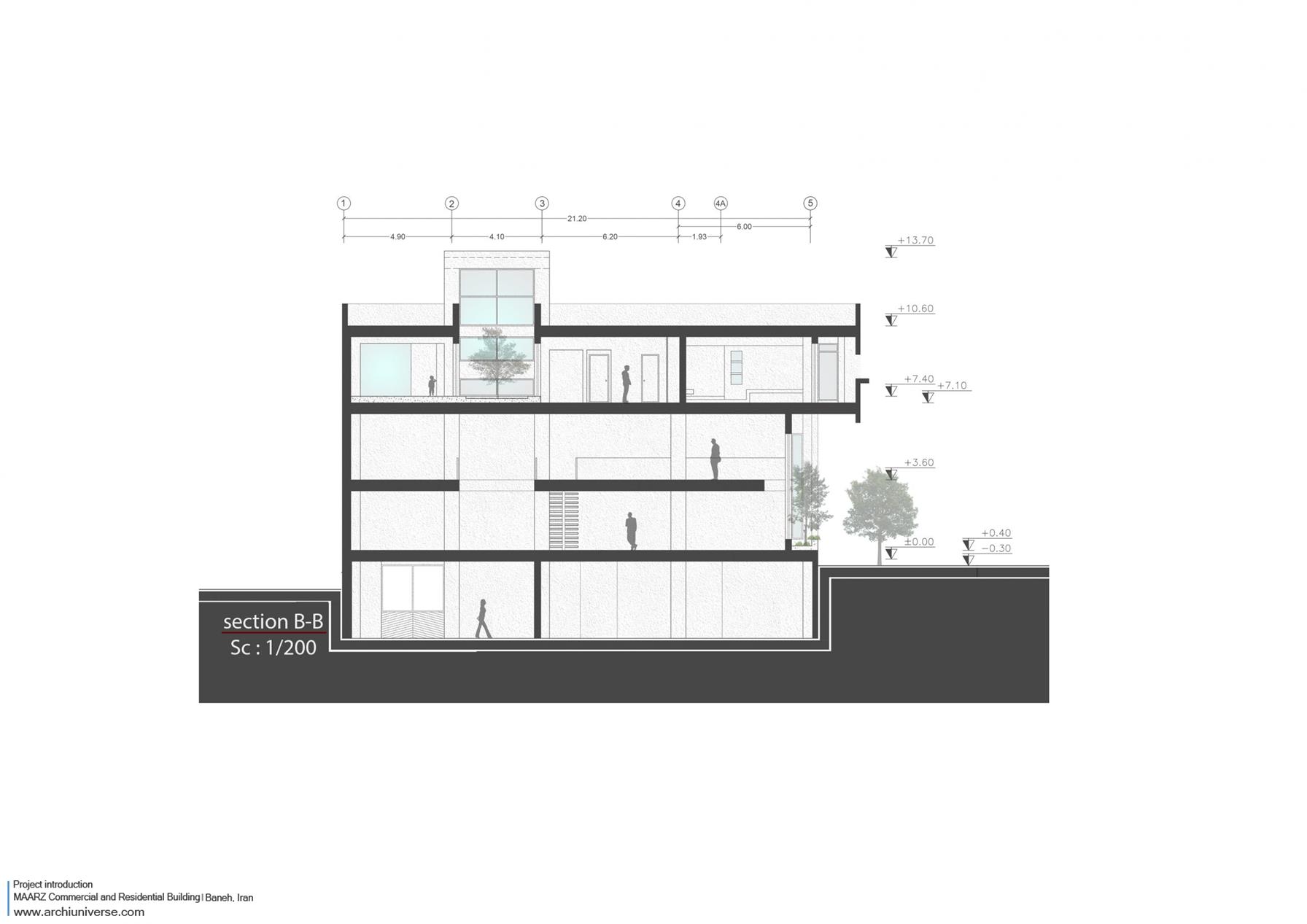
پلان
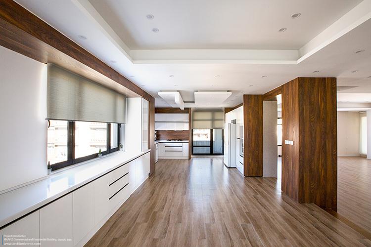
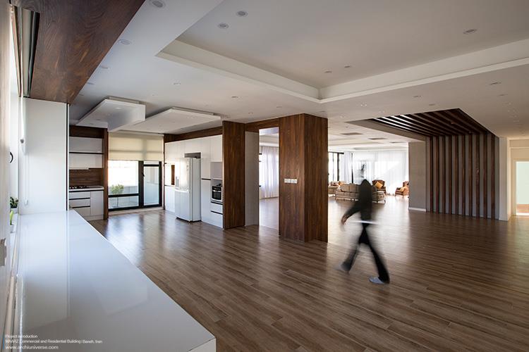
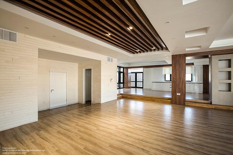
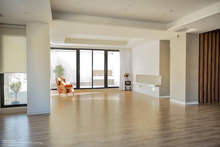
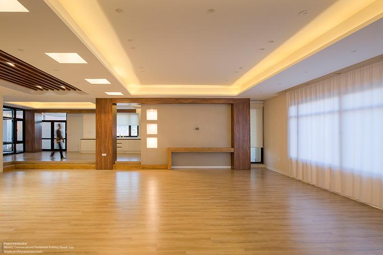
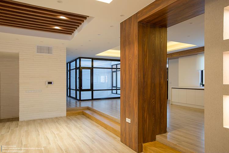
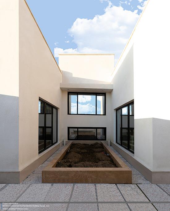
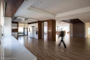
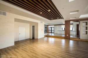
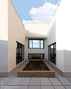
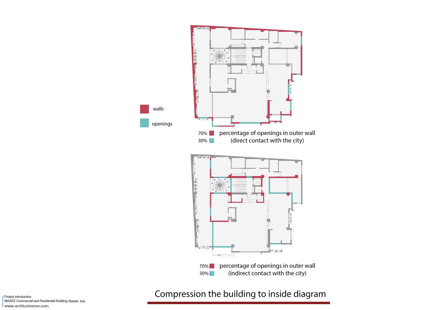
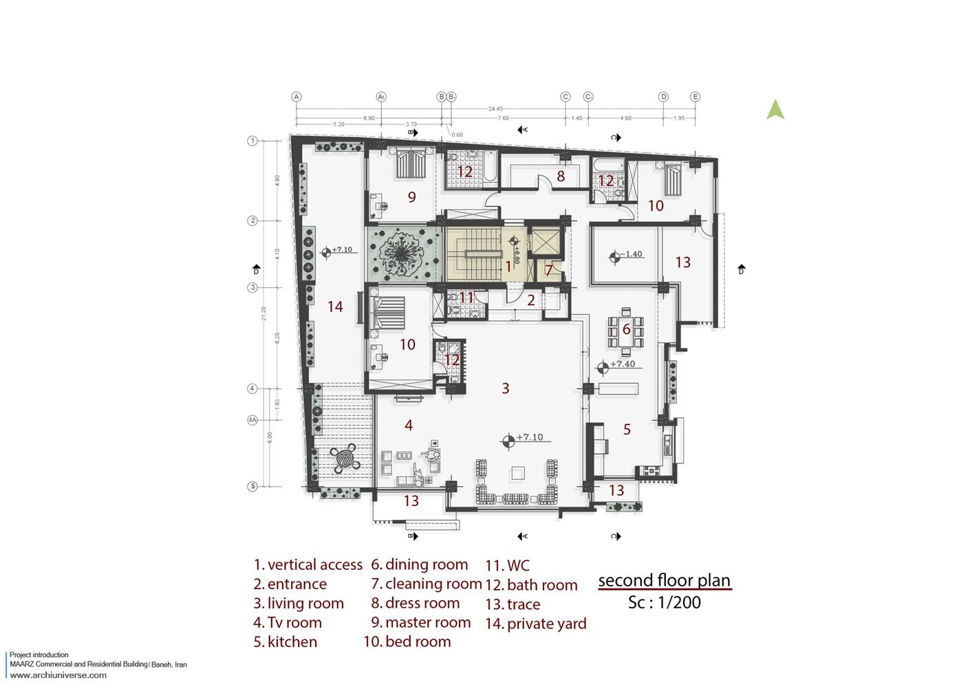
در شکل گیری پلان واحد مسکونی خواسته کارفرما فضایی کاملا تخت در یک طبقه بود. در ابتدا برای شکل گیری واحد، عرصه های عمومی و خصوصی از یکدیگر جدا شدند. همچنین حیاطی خصوصی به مساحت ۱۰۰ متر مربع در کنار واحد مسکونی دیده شد. این حیاط فضای نیمه باز اصلی در پروژه را شکل میدهد و محرمیت خود را نسبت به فضای بیرونی حفظ می کند. دسترسی به حیاط هم از عرصه عمومی (پذیرایی) و هم از عرصه خصوصی (اتاق خواب) امکان پذیر است و از سوی دیگر نورگیر اصلی فضاهای داخلی از این حیاط تامبن می شود. با توجه به فشردگی بافت شهری و تراکم بناها به داخل در این اقلیم، در شکل گیری پلان واحد مسکونی و بازشوهای آن نیز این ویژگی مورد توجه قرار گرفت تا پروژه خود را به داخل جمع کرده و بیشتر بازشوها به فضای داخلی (حیاط خصوصی) باشد.
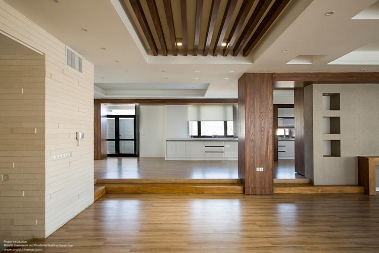
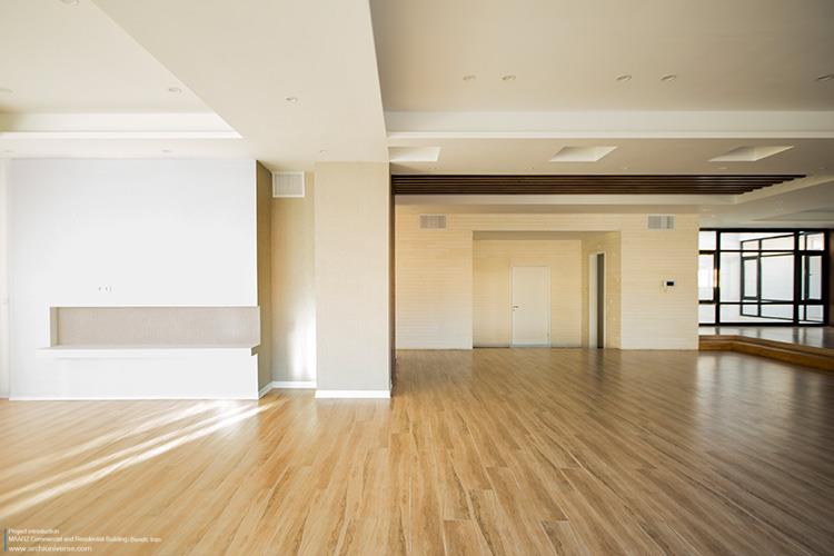
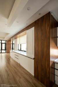
در تقسیم بندی واحد، پس از عبور از ورودی و فضای تقسیم وارد فضای پذیرایی با مساحتی حدود ۱۰۰ مترمربع می شویم. این فضا در کنار خود اتاق خواب میهمان و TV room را دارا می باشد. برای جداسازی بصری قسمت آشپزخانه و ناهارخوری که فضاهای خدماتی واحد می باشند از دو پله که اختلاف سطحی ۳۰ سانتی متری را به وجود می آورند استفاده شد . فضای ناهارخوری نیز از نورگیری که در قسمت مرکزی پلان تعبیه شد به آسمان دید دارد. در عرصه خصوصی نیز دو اتاق خواب با سرویس کامل و یک اتاق لباس با توجه به خواسته کارفرما تعبیه شد که هرکدام تراس های مجزای خود را دارا می باشند.
Form/function
About a century ago, modern architectural leader Louis Sullivan introduced one of the most famous slogans in modern architecture.
The form follows the function.
This motto was one of the main features of modern architecture, and has since been the basis of design and judgment in many architectural projects after him. The nature of this motto was that the overall form of the building was defined according to its function and thus specific forms for residential, commercial, cultural and other buildings were formed. For many years this feature has been at the forefront of designing architectural projects. But as time went on and new social and cultural needs arose as well as technology advanced, projects with different functions took on a new nature.
Rome Callas in the book S.M.L.XL evaluated architectural projects in terms of scale and considered the form of projects to be influenced by their social impact and scale. Frontier commercial and residential building is a reaction to the slogan of modern architecture (form follows function). Given the commercial and residential performance (single unit) as well as the scale and proportions of the project, the most important project challenge was the coordination of these two functions in terms of building volume and the question of whether the form really follows the design was challenged.
Context / site / application
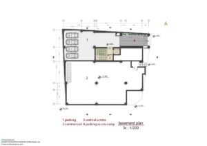
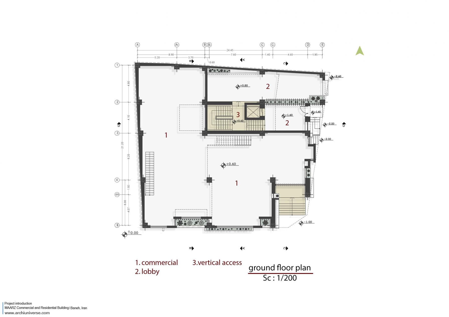
Frontier Commercial and Residential Building is located in Baneh Frontier City in Kurdistan province. Baneh is located on the northern slope of the Zagros Mountains and has a mountainous climate. The texture of the city is compact to prevent heat loss. Most of the materials used in buildings are stone and most buildings have a cream-earth color spectrum. The project site is located on one of the main boulevards of the city and is at the corner of an alley. The project area has an area of 500 square meters consisting of three blocks of adjacent blocks. The project plan was designed to include an underground (parking and commercial) a ground floor, and a half-floor (commercial) and one floor on which included a flat unit. The employer wanted the basement business to be connected to the ground floor business as well as a completely separate entrance to the residential unit. Thus the project plan was summarized in one commercial unit and one residential unit. Putting these two functions together that are completely different in nature and needs and coordinating them in one project was the most important design challenge.
Plan
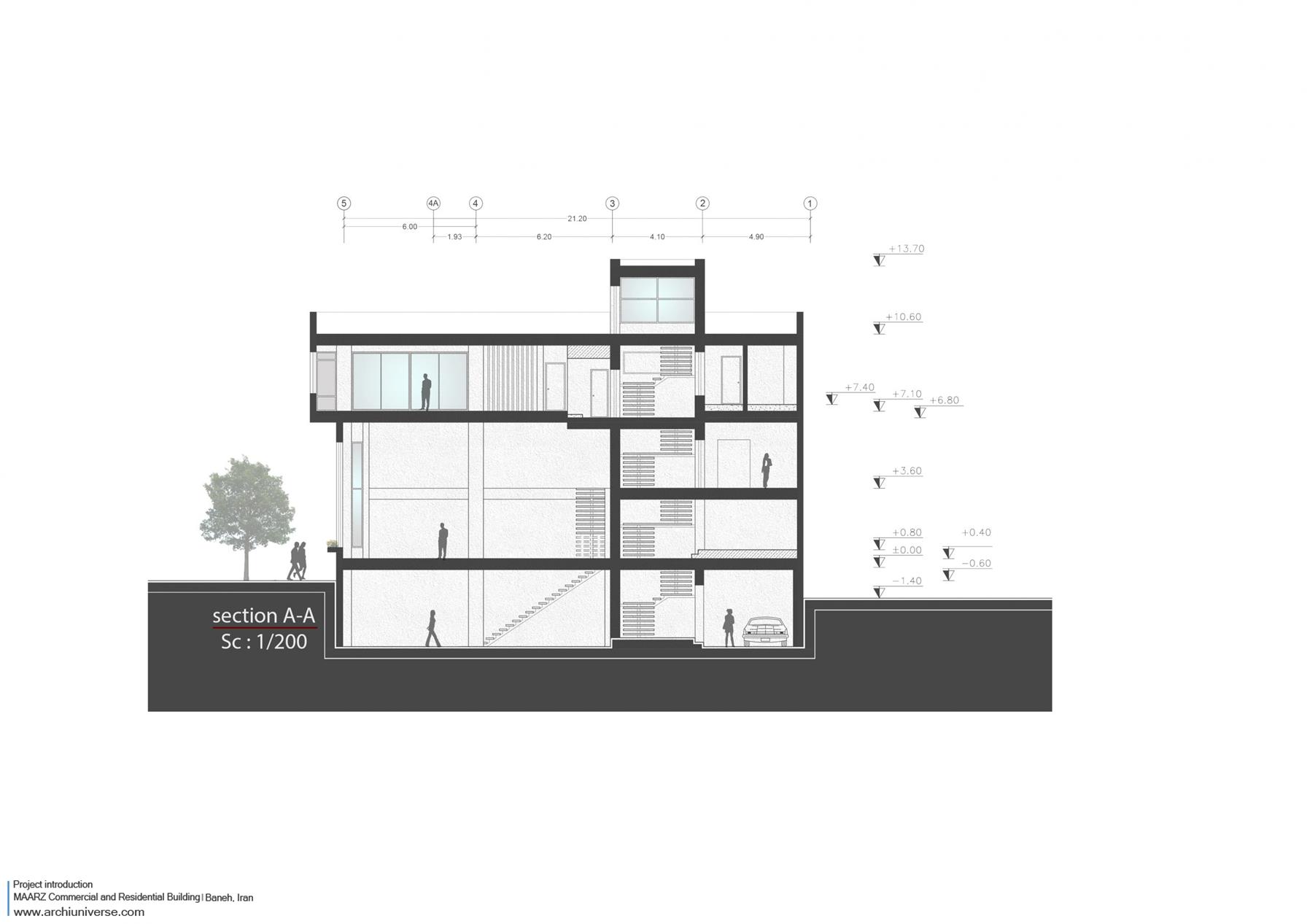
Given the project plan (a business unit and a residential unit) and the scale of the project relative to the urban fine-grained texture, the most important issue of the project was the overlap between these two functions. The question was how the project should be able to present itself as an integrated volume in the urban context and also be a response to the main slogan of modern architecture (form follows function). Thus, due to the existence of two different functions in the project and their effects on the exterior wall and their visual value in volume (in terms of length and height proportions), an integrated and coordinated volume that is generally seen as a continuous form is examined. In order to advance this idea and considering the longitudinal, transverse and height proportions of the building and coordinate the volume with the urban fine texture, a volume crushing strategy was used. Due to the interiors of the project and the need for light spaces, the pages were considered to form the bulk of these pages side by side. These pages and the type of segmentation and their proportions were formed on the basis of golden proportions to maximize visual output. For commercial space, larger-scale plates and larger pop-ups, and for residential spaces, due to its internal function, space-adapted pop-ups were formed. The project thus became pages that come together into a single volume that, in addition to aligning with the context around it, had a challenge within itself in adhering to the form of the function.
As the pages were divided into several smaller volumes, the project became deeper by moving the pages backwards and forwards, and the two-dimensional view became three-dimensional. The pop-ups on each page were shaped with details that indicated the page’s cutout. After the overall volume, pages and popups were formed, a color element was used to visualize the project in urban context. Thus, all of the volume forming plates were made of white cement and black between the plates. Finally, his project appeared in black and white in the urban context.
Step
Another issue that was considered in the design of the residential space was the creation of a layer between the indoor and outdoor space that would have both the quality of the space. This space was formed at the entrance stairs of the residential unit and made the access stairs, usually located in residential buildings as dead space, transform into a dynamic and usable space. This layer is between the inside and outside, this and that. In addition to preserving some of the qualities of the outer space (sky view and continuous empty space), it also features indoor spaces such as privacy. By creating this space, it was attempted to organize the staircase and take on a new nature, allowing the user to enjoy the quality of the space in a private courtyard that is also connected to the exterior.
Pop-up
The placement of the pop-ups was tailored to the needs of the interior for light. So that each space has the amount of light needed depending on its size. Once the pop-ups were formed, specific details were designed to better align with the project. These details were shaped such that each pop-up cuts a portion of the plate on which it is placed and turns the cut section into a 90 ° rotating platform for plant and flower placement. As such, each pop-up with a slit panel also provides greenery, in addition to providing light and ventilation.
Plan
At the time of the formation of the residential unit plan the client requested was a completely flat space on one floor. At first, the public and private arenas were separated to form a unit. A private yard of 100 square meters was also found next to the residential unit. It forms the main semi-open space in the project and retains its privacy to the exterior. Access to the courtyard is possible from both the public (reception) and private (bedrooms) areas and on the other hand, the main skylights of the interiors come from this courtyard. Due to the compactness of the urban texture and the density of the buildings inside this climate, this feature was also taken into account in the development of the residential unit plan and its openings so that the project could be assembled and most of the openings would be indoor.
In the unit segmentation, after passing through the entrance and the division area, we enter the reception area with an area of about 100 square meters. It has a guest bedroom and a tv room next to it. The two staircases that make up the 30cm surface difference were used to visually separate the kitchen and dining areas, which are single service spaces. The dining area also overlooks the skylights that are embedded in the central part of the plan. In the private area, there were two full-service bedrooms and a dressing room according to the employer’s request, each with its own separate terraces.
” تمامی حقوق مادی و معنوی محتوا متعلق به پایگاه خبری جهان معماری می باشد “


